My favorite projects of 2025
2025 was a big year for me & my business! I worked on a record number of projects, and as we kick off the new year, I wanted to highlight some of my favorites.
These are truly in no particular order. All just work I’m excited to share.
Shout out to my clients and collaborators who made last year spectacular. I’m looking forward to more fun in 2026!
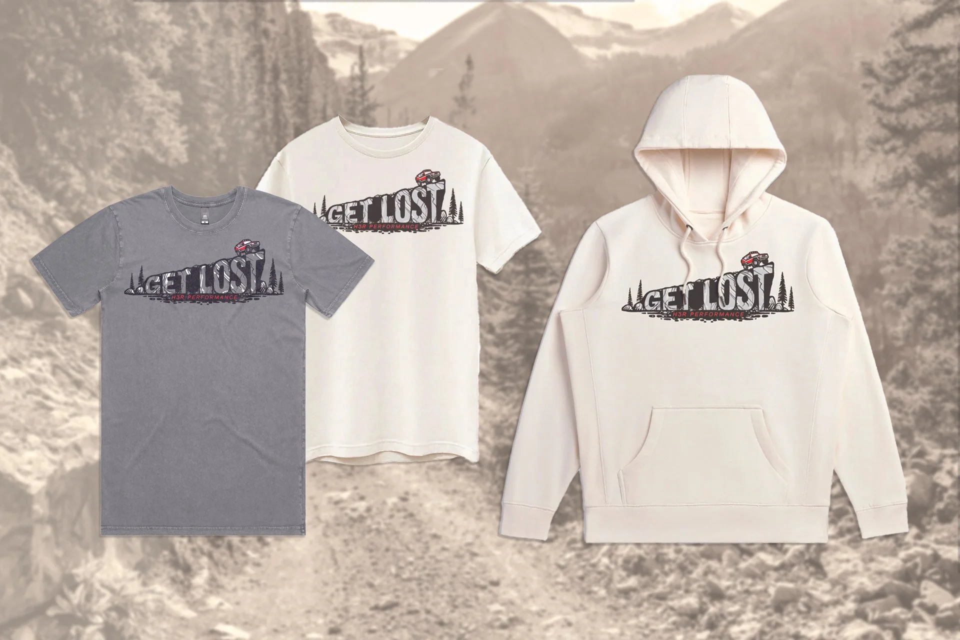
H3R Performance Merch
OVERVIEW
In early 2025, H3R Performance, an automotive accessory brand, sought my help to design merch that helped increase brand loyalty and specifically targeted their overland customers—rugged automotive enthusiasts who were drawn to the freedom of off-road exploration.
PROCESS
I came up with three different design concepts, and with the client’s feedback, developed designs to use across a collection of two t-shirt variations and a hoodie. With the help of my production partner, we selected garments that were high quality and made in the USA with sustainable fabrics.
RESULTS
Unfortunately, due to economic uncertainty in the first half of 2025, this project never made it to production. But I’m thrilled with the designs I developed, the garments we selected, and the partnerships I solidified with both the client and the production partner.
WHY IT’S MY FAVORITE
As someone who loves adventuring and camping in the back of my Subaru, I’ve always fantasized about becoming an overlander, like the target audience. So it was fulfilling to imagine going down that trail myself.
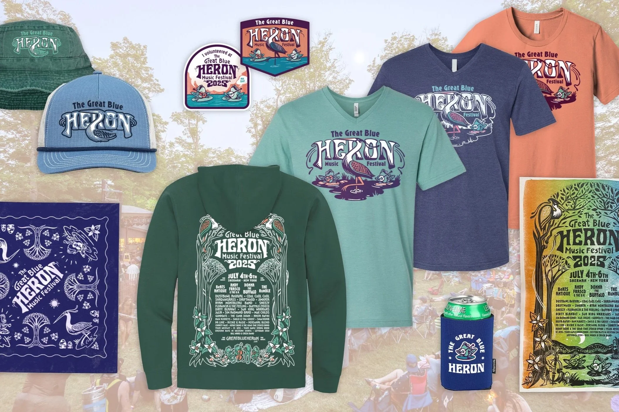
The Great Blue Heron Music Festival Merch
OVERVIEW
The Great Blue Heron Music Festival asked me to design their merch collection for the third year in a row. This year, the festival organizers sought to increase profitability to help pay for major infrastructure projects. So in addition to design & illustration, the organizers requested my help with strategy, merchandising, and production coordination.
PROCESS
Really, this process starts at the beginning of the year, when we design the poster & marketing collateral. The promo sets the tone for the festival, and the merchandise follows suit. Once promo is finalized, I translate that design across a collection of merchandise. Each piece of merchandise—t-shirts, hoodies, stickers, koozies, and more—needs to be a stellar item on its own, while also fitting in with the collection as a whole. It’s a delicate balance, and one I’m getting better at every year.
RESULTS
By developing a merchandising strategy and analyzing previous years sales, I helped the Great Blue Heron grow their return on investment from 11% in 2024 to 66% in 2025.
WHY IT’S MY FAVORITE
There’s nothing as rewarding as working for this festival. After the months stressing over compositions and production specs and ship-by dates, I close my laptop and head up to the festival for a long weekend. It’s the best way to celebrate a job well done—dancing and camping and vibing in the sunshine. And I get to see how stoked festival goers are about the merch, and it’s just awesome.
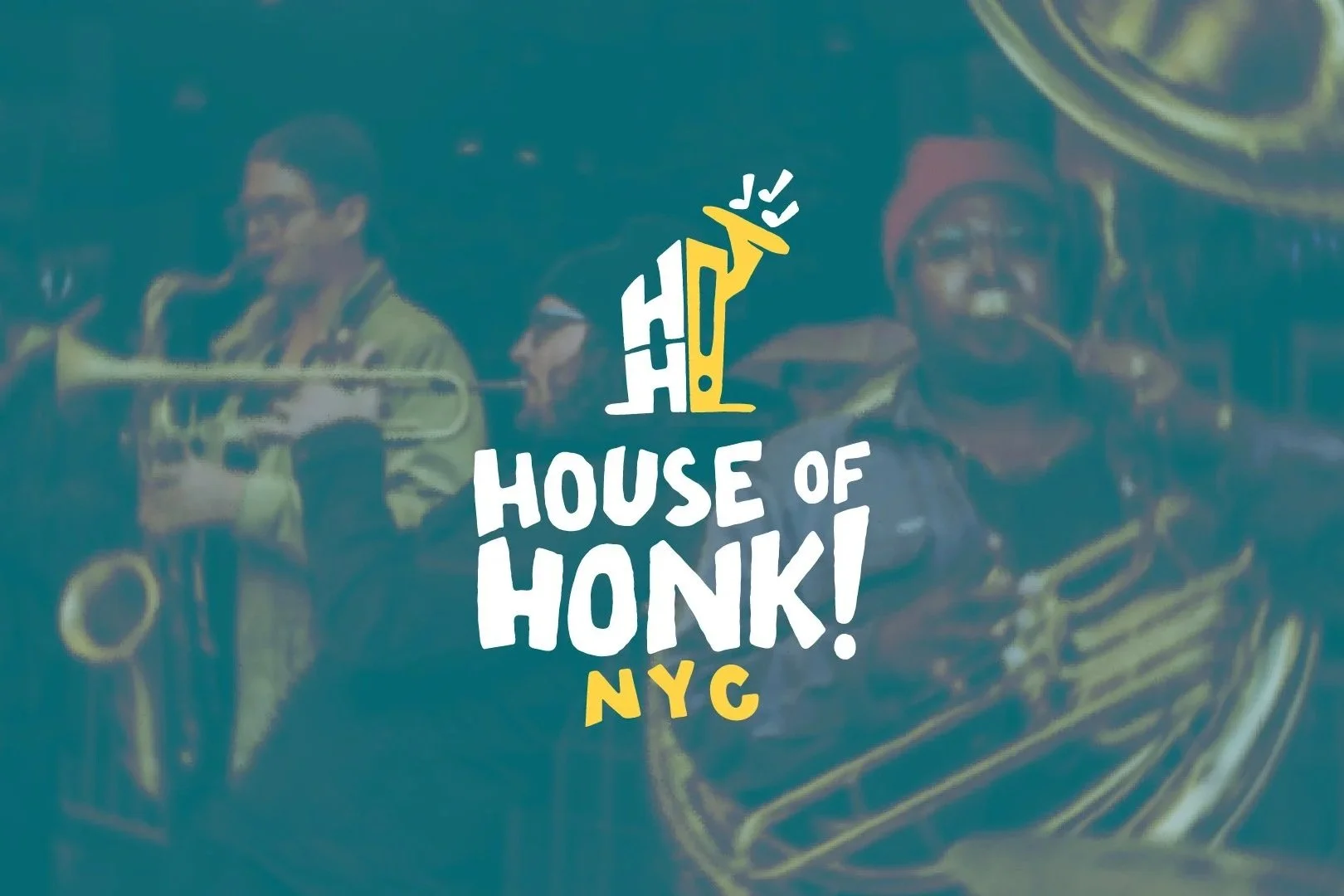
House of Honk! Logo System
OVERVIEW
After working together on the poster for Honk NYC! Festival, the organizers asked for my help finalizing a logo for their new non-profit, House of Honk! The organizers had worked with a few other designers to develop a logo, but it wasn’t quite working. So I jumped in!
PROCESS
At first the project seemed simple—the client had a rough logo that another designer had developed, and they just wanted me to make a few adjustments. Easy, right?
But when I started digging in, I saw opportunity to take their concept and make a logo system that better represented their mission and was more adaptable.
I developed a visual system of logos and colors that could be used across platforms and use cases, and I packaged everything up nicely with logo usage guidelines.
RESULTS
The client has a new visual identity which can immediately be applied across social media, letterheads, fundraising campaigns, and more.
WHY IT’S MY FAVORITE
This project had a really clear A-Ha Moment for me. The logo concept was a house, a visual representation of the home for street bands & merrymakers across NYC. I was sketching some different houses to consider, when suddenly it hit me: houses don’t look like that in New York City. It was a simple thought that became huge revelation and completely changed the trajectory of the project. From there, the rest of the logo system fell right into place.
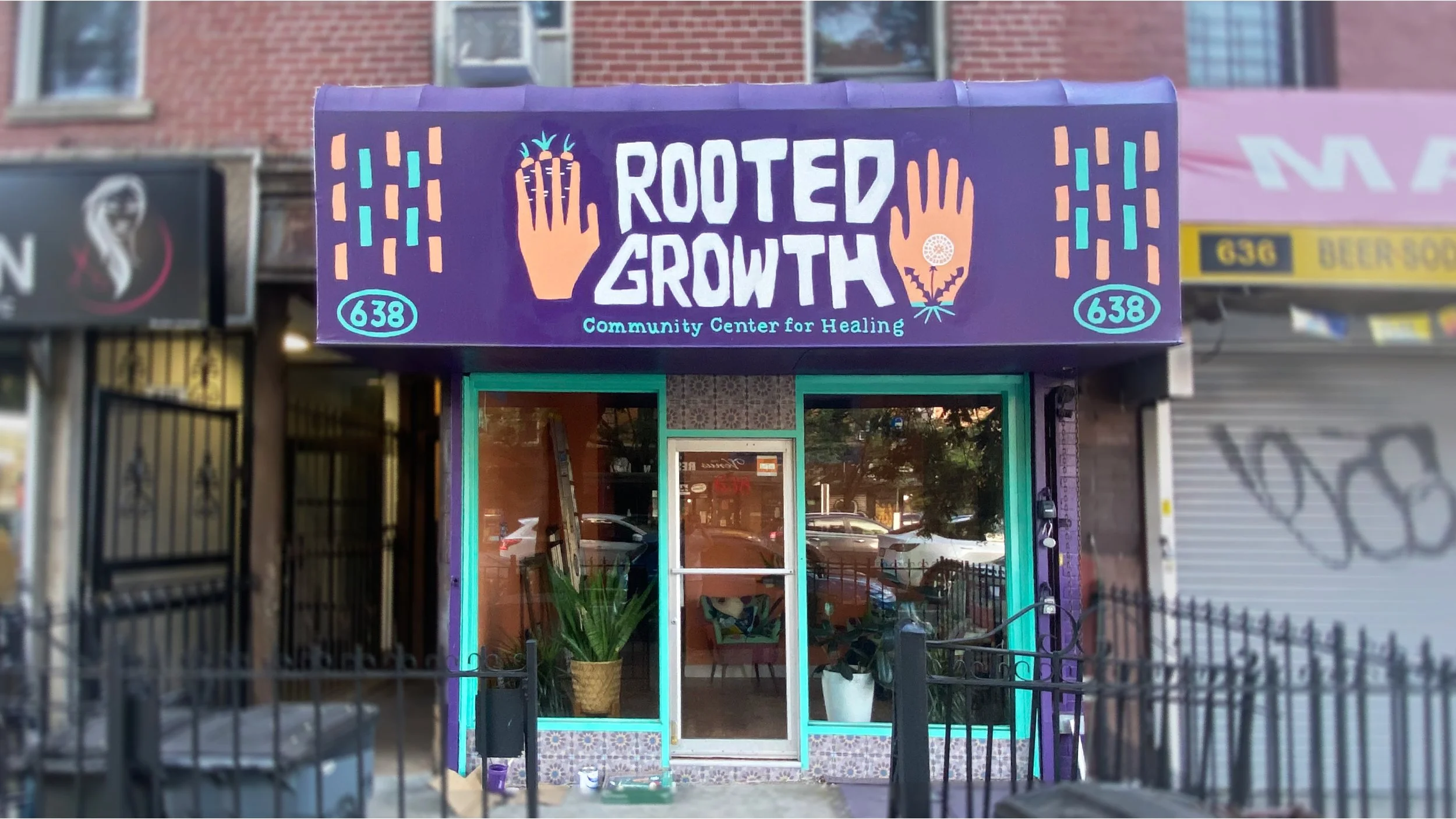
Rooted Growth Branding
OVERVIEW
The founding members of a healing collective planned to open a community center in Brooklyn. The center would broaden the idea of what healing looks like through arts- and community-focused programming.
The organizers wanted this brand to be unlike any other business or community space in the neighborhood, or perhaps in the whole city. The vision was radical & urgent to meet the needs of the community, yet soft & approachable to create a healing environment. And because the space centered people and art, the entire brand was designed & delivered by hand.
PROCESS
I created a system of logos which were designed to be easily reproduced by any artist in any medium. The deliverables included hand-carved stamps for each logo. I also painted the primary logo on the storefront and additional elements in the space by hand.
RESULTS
With a bright and unmistakable storefront, Rooted Growth’s visual identity has increased awareness of the space. The excitement in the neighborhood has helped support the collective’s mission of creating a holistic space for healing.
WHY IT’S MY FAVORITE
This project was an incredible opportunity to use my hands. Throughout the process, I blended digital and analog design processes. I also got to paint a storefront, which I was kind of a bucket list item (even though I’m afraid of heights and never want to work on a ladder again). This project was—and continues to be—a joyful collaboration.
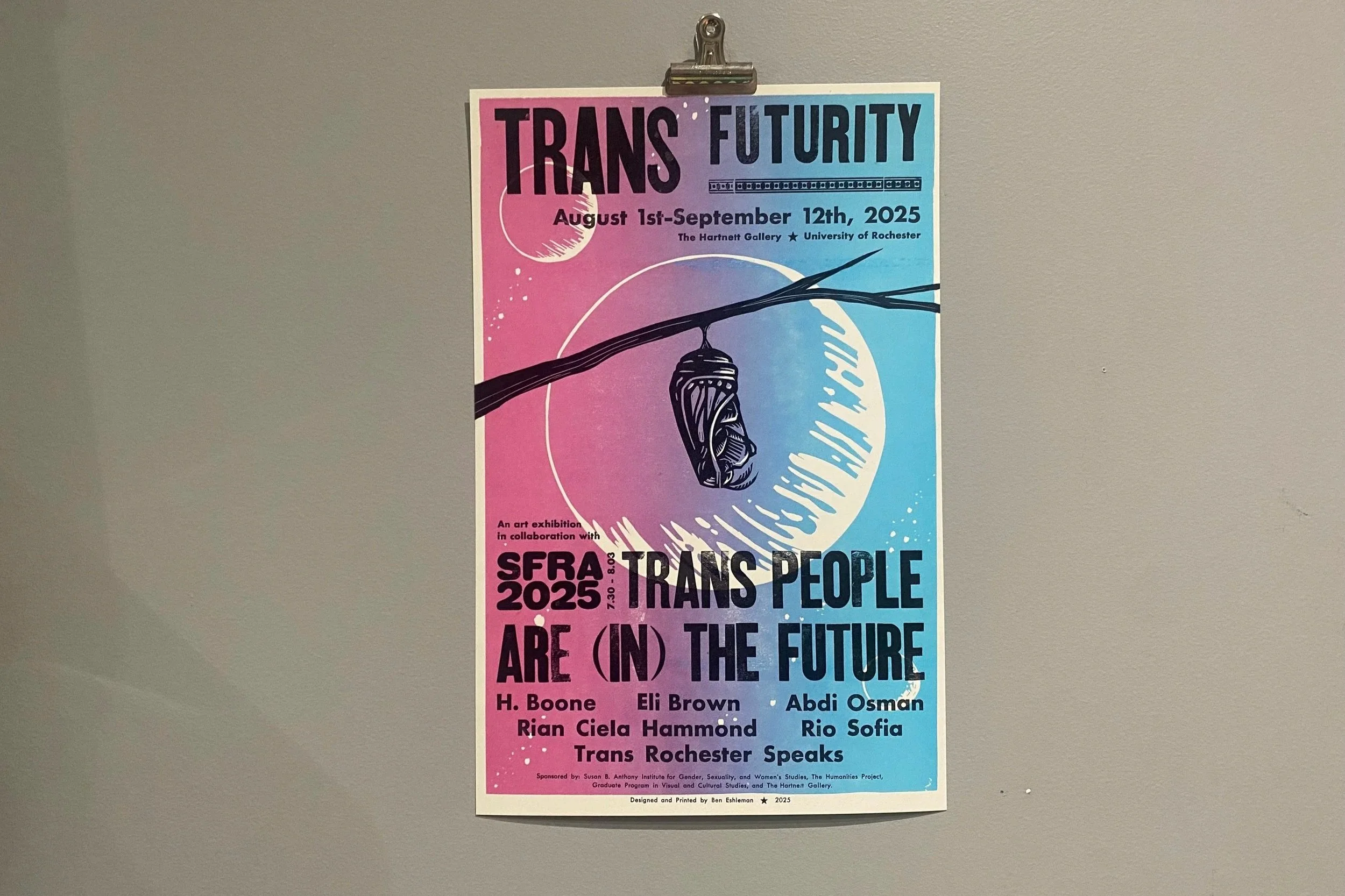
SFRA x Trans Futurity Posters
OVERVIEW
Some folks at the University of Rochester asked me to design original artwork relating to the Science Fiction Research Association’s annual conference and its theme: Trans People Are (In) The Future. The conference also aligned with an art exhibition on campus titled Trans Futurity.
The client asked for 150 letterpress printed posters, specifically requesting to use antique wood type and hand-carved linocut blocks. They also requested a design for tote bags for conference attendees that complimented the posters.
PROCESS
I sketched up some concepts, set & proofed the antique type, carved the block, and printed 150 posters layer by layer. These are limited edition reduction lino-block posters, hand carved and letterpress printed on Vandercook proofing presses alongside antique wood and metal type. The printing was done in two different community studios in New York City.
RESULTS
To my absolute dismay, most of the original posters got lost in transit to the client. The few remaining original posters were given to keynote speakers of the conference, and thanks to the client’s quick thinking, we provided digitally printed posters for conference attendees. The original posters eventually made it to the client, albeit long after the conference wrapped up. Definitely not ideal, but still better than nothing!
WHY IT’S MY FAVORITE
This project brought together a bunch of my interests—sci-fi, trans theory, letterpress printing, and University of Rochester (where I attended my freshman year of college). It was a joy to collaborate with people I used to share community with, print a bunch of posters with my hands, and then attend a sci-fi conference!