
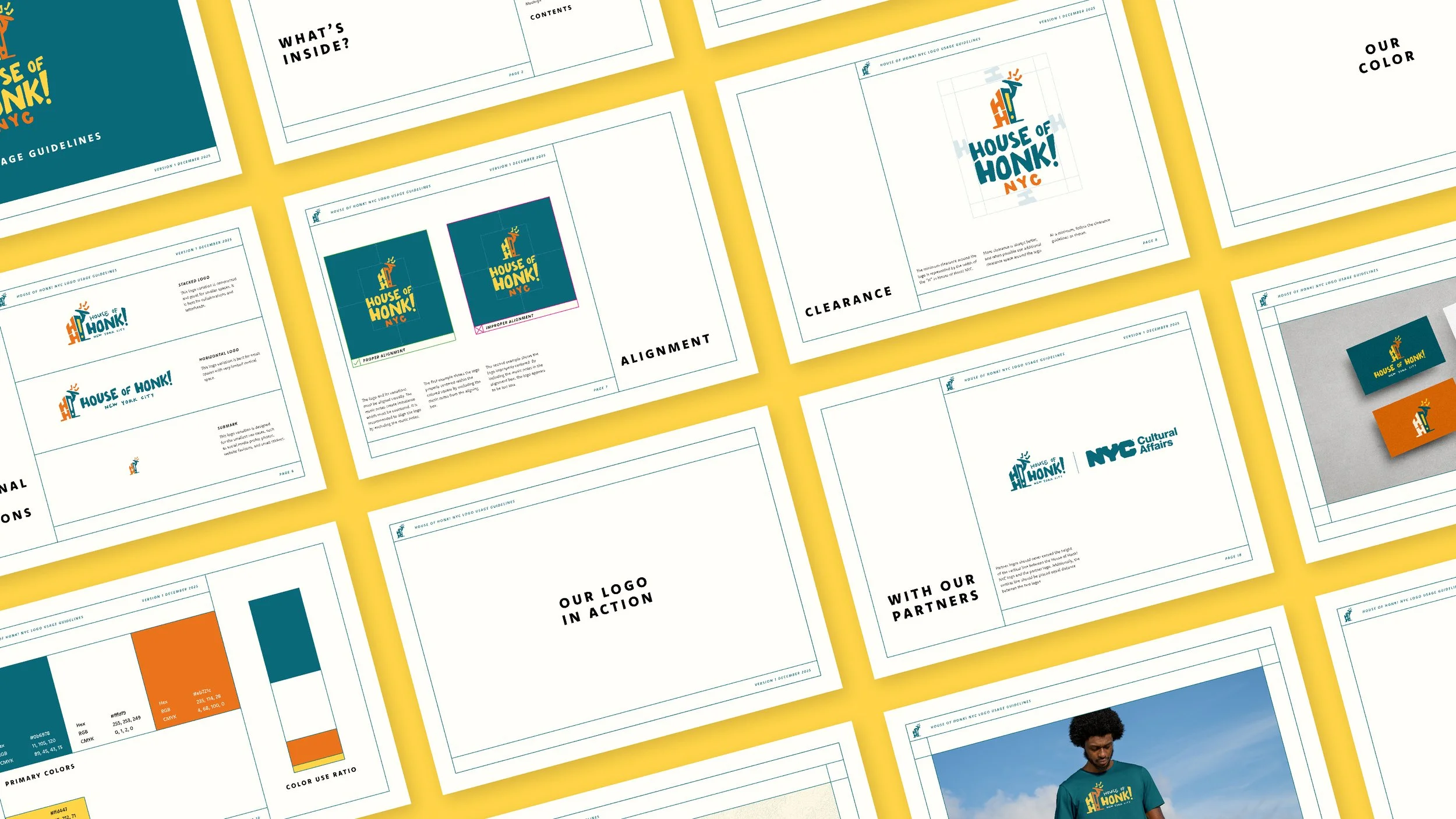
house of honk! logos
logo system for street band non-profit
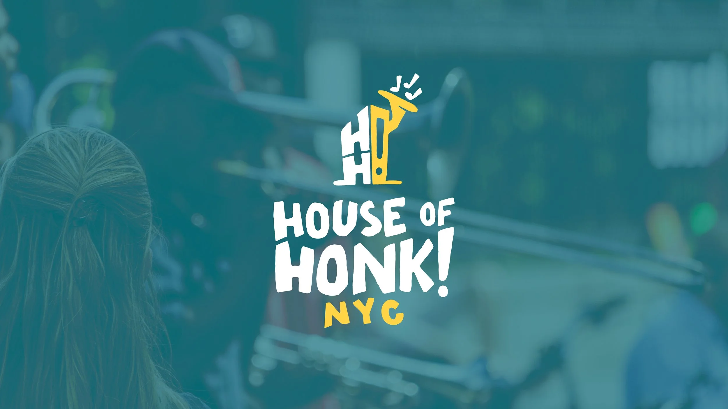
This logo system was created for House of HONK! New York City, a nonprofit organization dedicated to bringing street band music & spectacle culture to audiences across NYC and beyond.
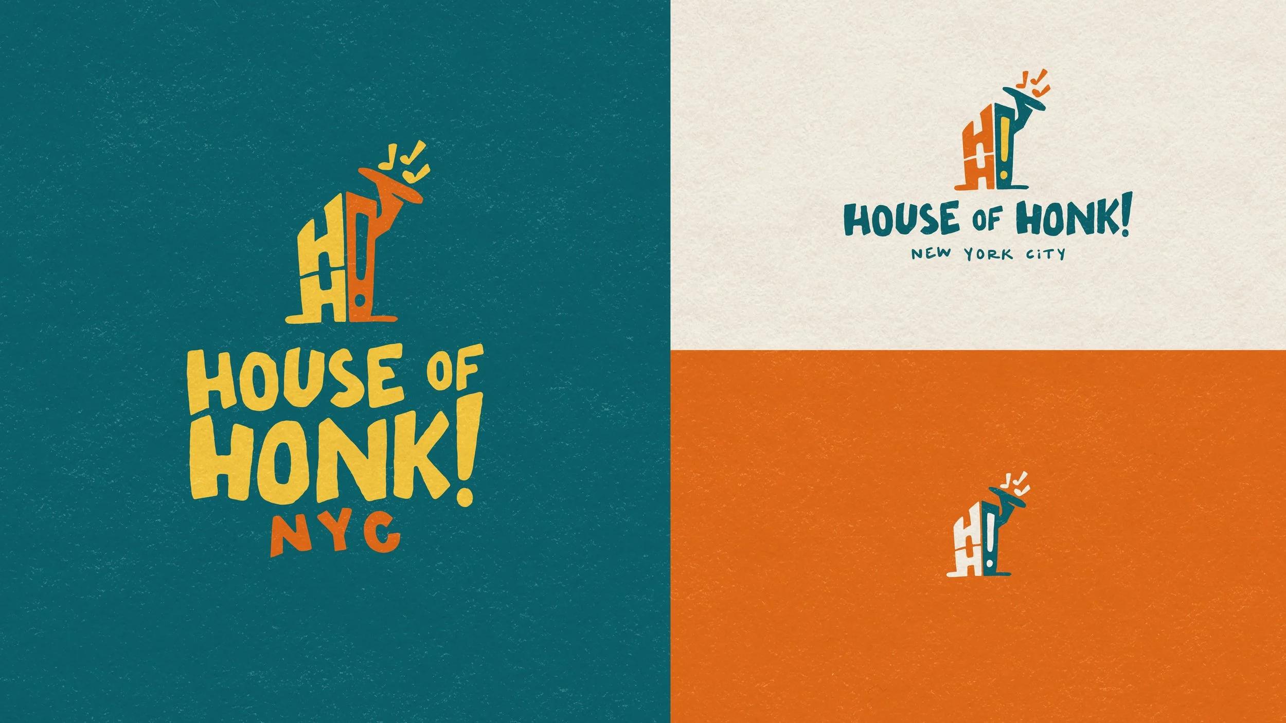
The challenge was to create a logo that captured the DIY energy of street band culture while also radiating confidence in the arts nonprofit industry.
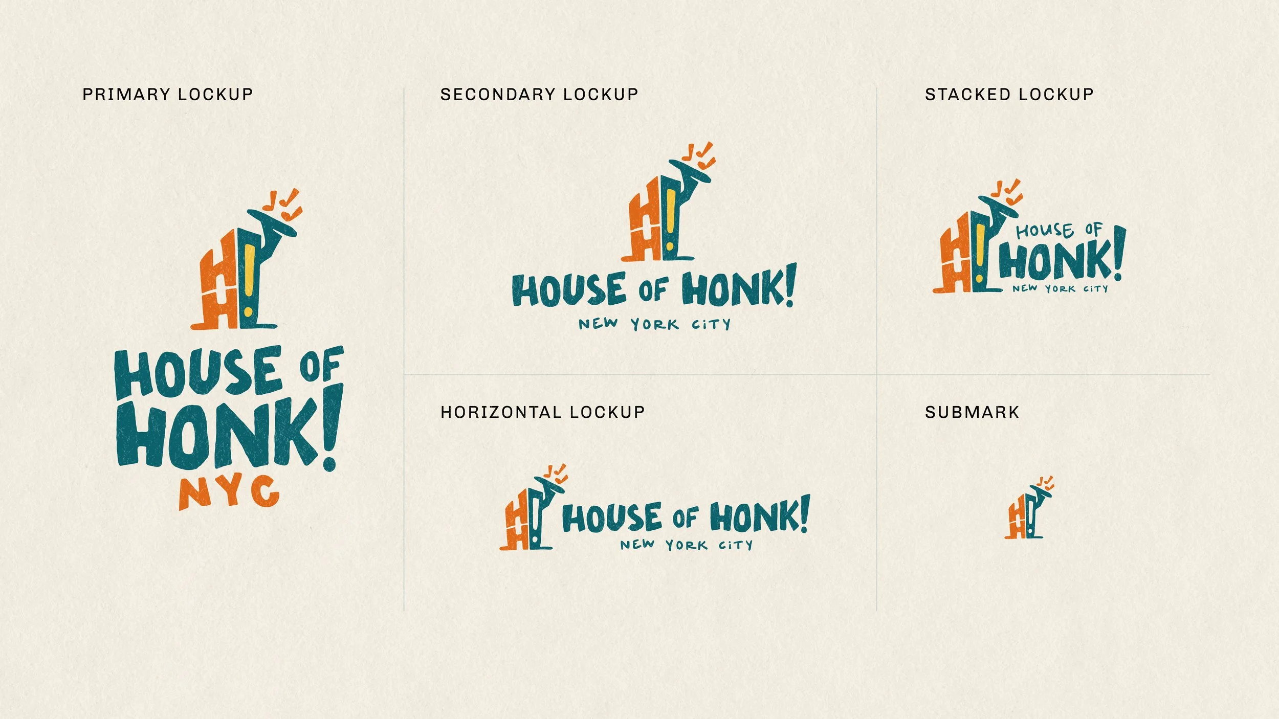
While the project began as a refresh of an existing logo, we saw an opportunity to elevate the concept into an unforgettable mark and transform the design into a scalable logo system.
Organizers called the new logo system “a level up, for sure.” The new logo system has brought confidence and professionalism to the organization, while maintaining their character. This project has given the organization an imperative to reflect on and strengthen the brand identity, brand architecture, and visual identity of the organization.
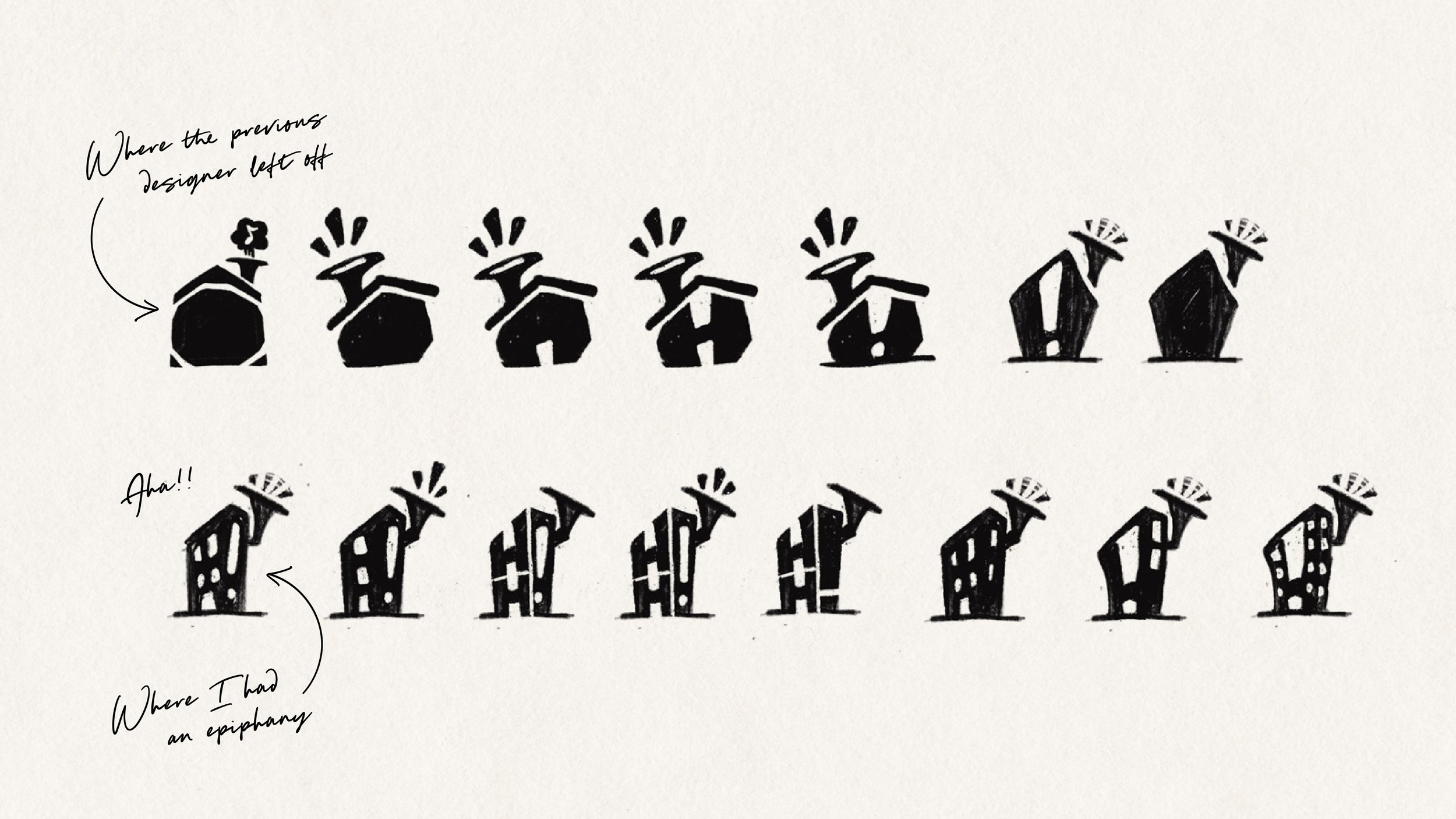
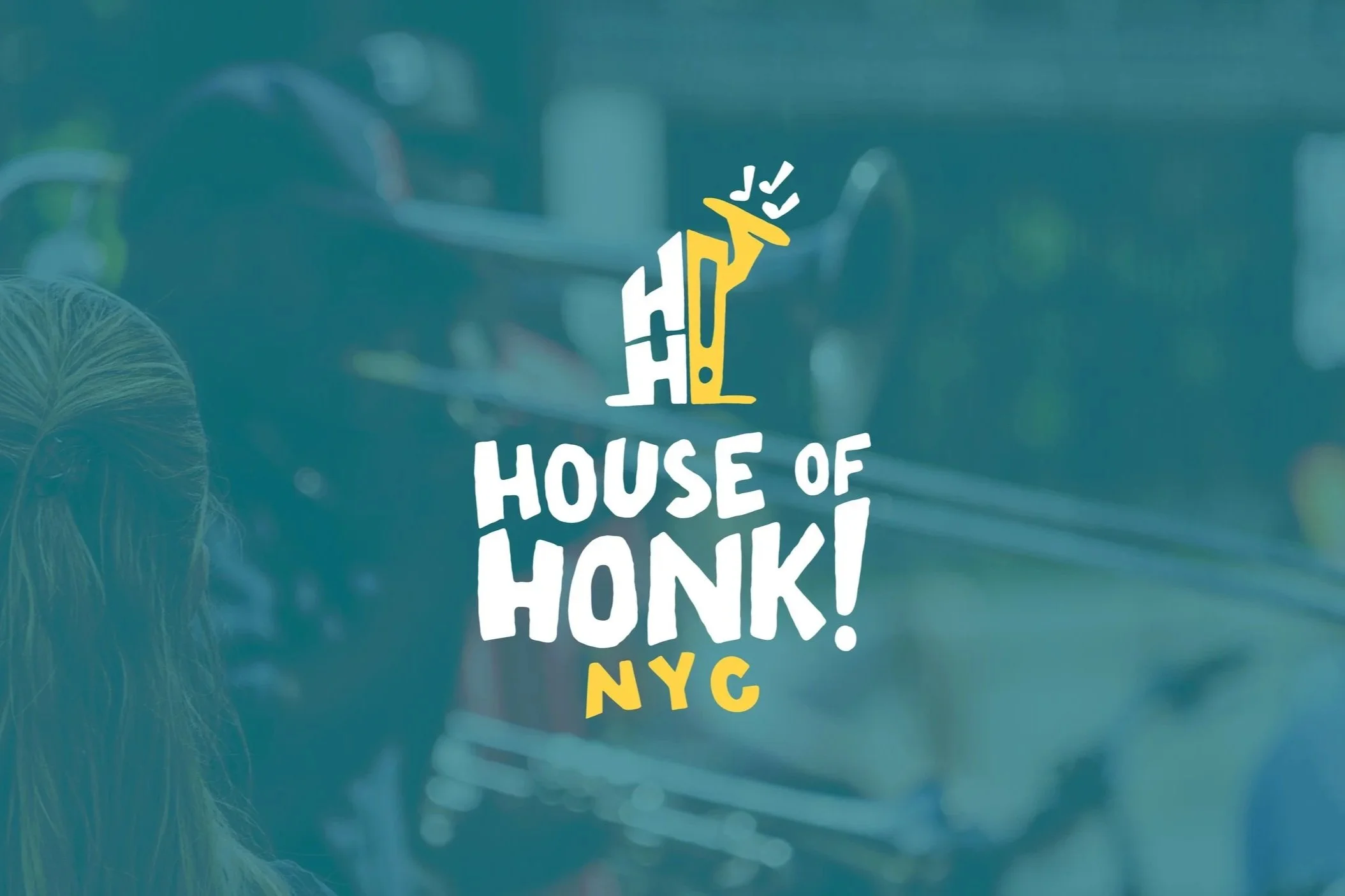
An “Aha” Moment
The logo concept was a house—a visual representation of the home for street bands & merrymakers across NYC. I was sketching some different houses to consider, when suddenly it hit me: houses don’t look like that in New York City. It was a simple thought that became huge revelation and completely changed the trajectory of the project. From there, the rest of the logo system fell right into place.
Check out House of Honk!

more branding projects