
Rooted growth branding
a visual identity designed & delivered by hand
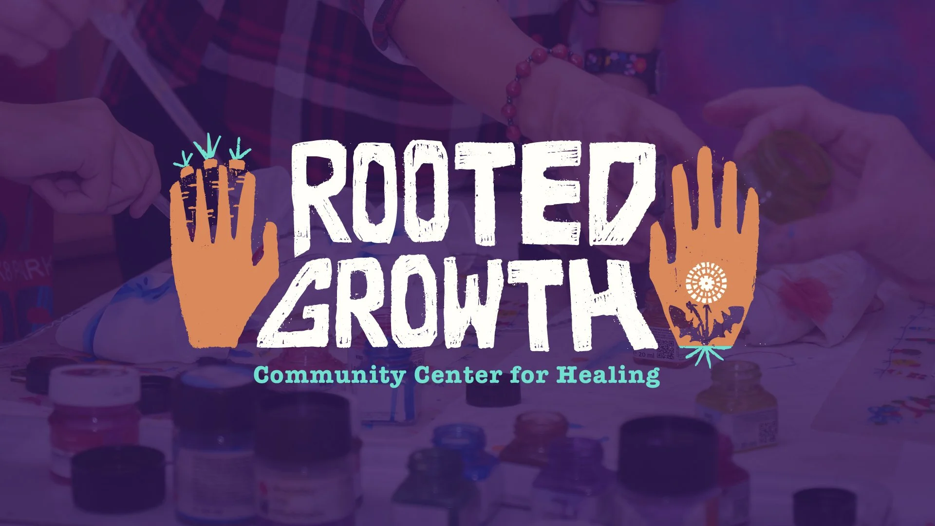
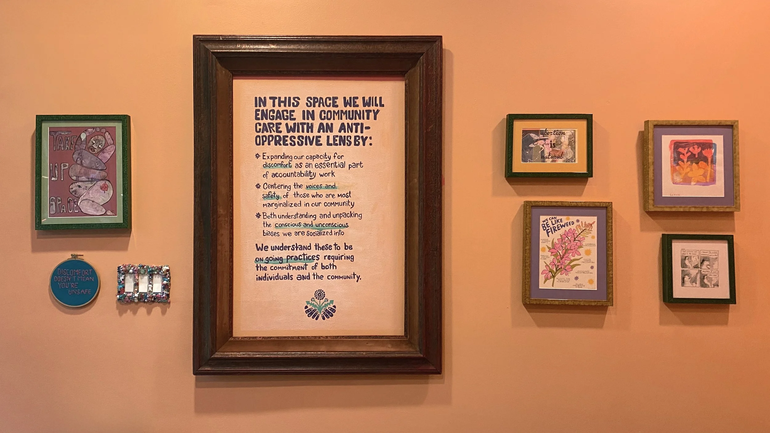
The founding members of a healing collective planned to open a physical space in Brooklyn. It would be a community center which broadened the idea of what healing could look like, and which created a space to connect with community, a space for therapy sessions, and a space for artists.
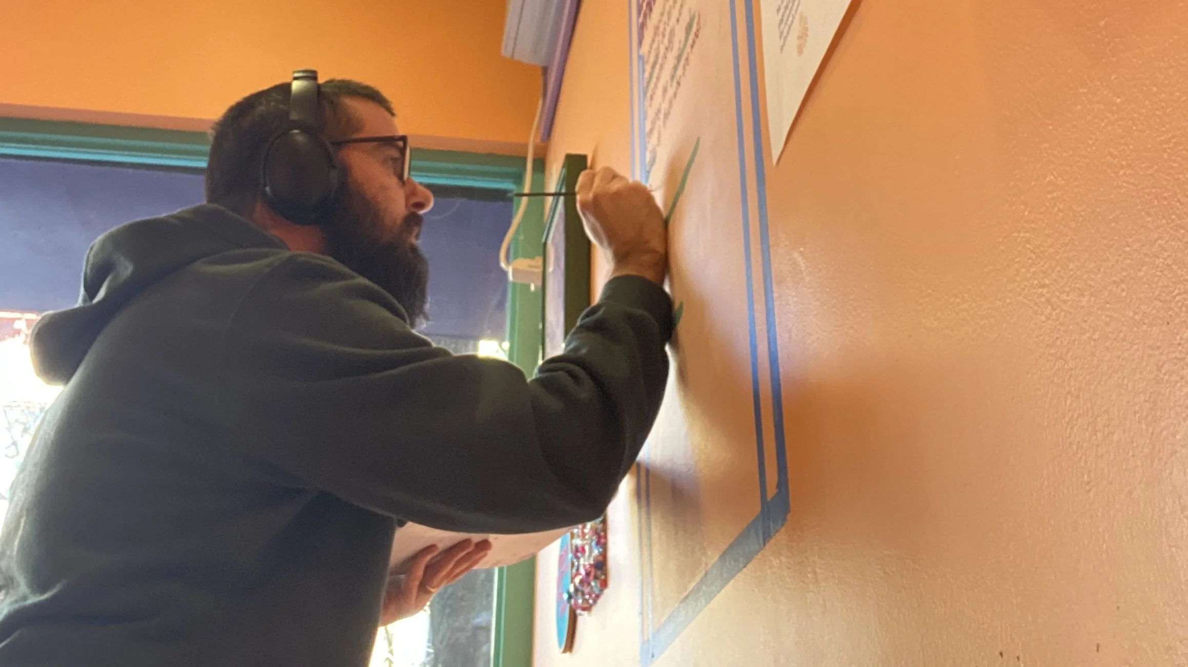
The vision for the brand was unlike any other business or community space in the neighborhood, or perhaps in the whole five boroughs. The vision was radical & urgent to meet the needs of the community, yet soft & approachable to create a healing environment. And because the space centered people and art, the entire brand was designed & delivered by hand.
Roles
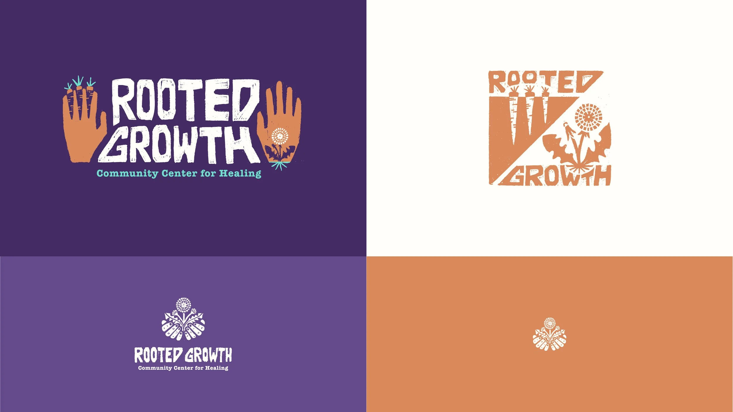
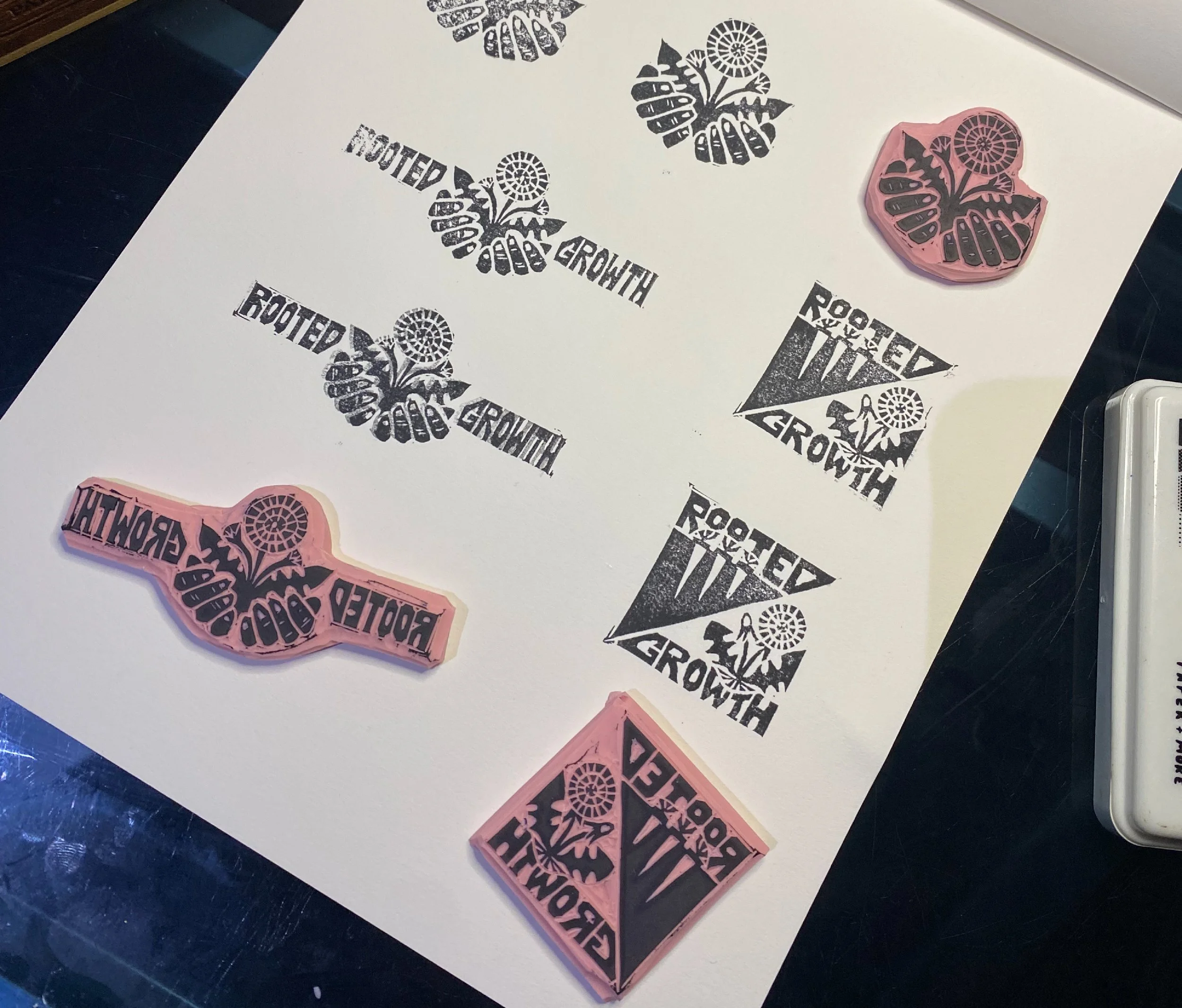
Logo Design
Visual Identity
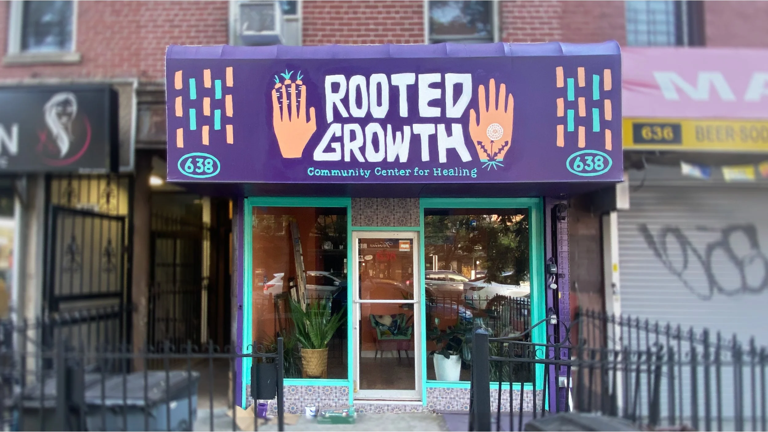
Mural Painting

Back to branding