Rooted Growth: Designing a non conformist visual identity that delivers
When Rooted Growth Community Center for Healing opened its doors in Brooklyn, it wasn’t trying to blend in. The center was built around a radical idea: healing is community work. With arts‑ and community‑focused programming at its core, Rooted Growth needed a visual identity that reflected its values while standing apart from the sea of wellness brands and community centers surrounding it.
From the beginning, the challenge was clear. There are countless yoga studios, counseling spaces, and wellness centers across the five boroughs. And to make things even trickier, “Rooted Growth” is a surprisingly common name. A quick search revealed dozens of similarly named organizations, many of them using the same colors, symbols, and visual tropes. Differentiation was essential.
The process began, as always, with alignment. Before I even started sketching, we scheduled a Discovery & Clarity Call. The client talked, and I listened. Together, we clarified the heartbeat of the brand: its purpose, vision, and mission, as well as the attitude, values, and audience.
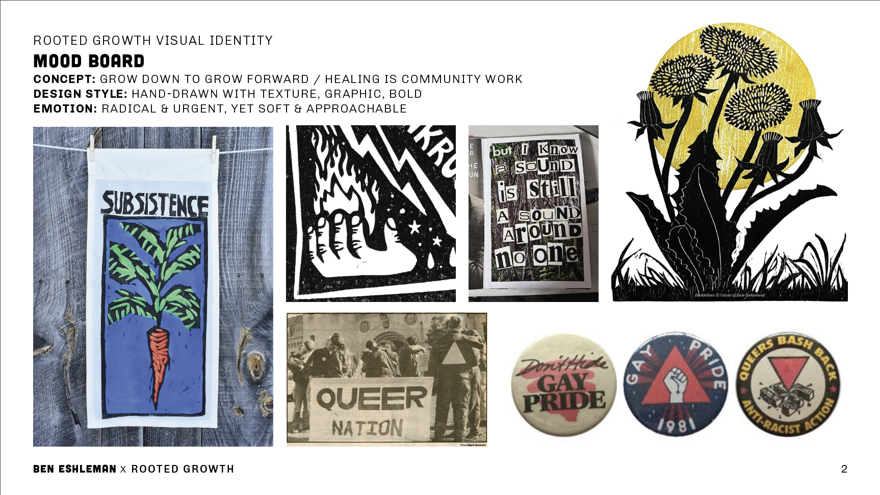
When I got to work, I pulled inspiration from sources rooted in collective creation and resistance, like Bread + Puppet Press, 80s and 90s queer activism, handmade protest graphics, zines, and community signage. I didn’t use these references as a way to copy other work, but as a way to cultivate meaning. The references shared a DIY spirit that was intentional, expressive, and deeply human. Exactly what Rooted Growth needed to feel radical and yet approachable.
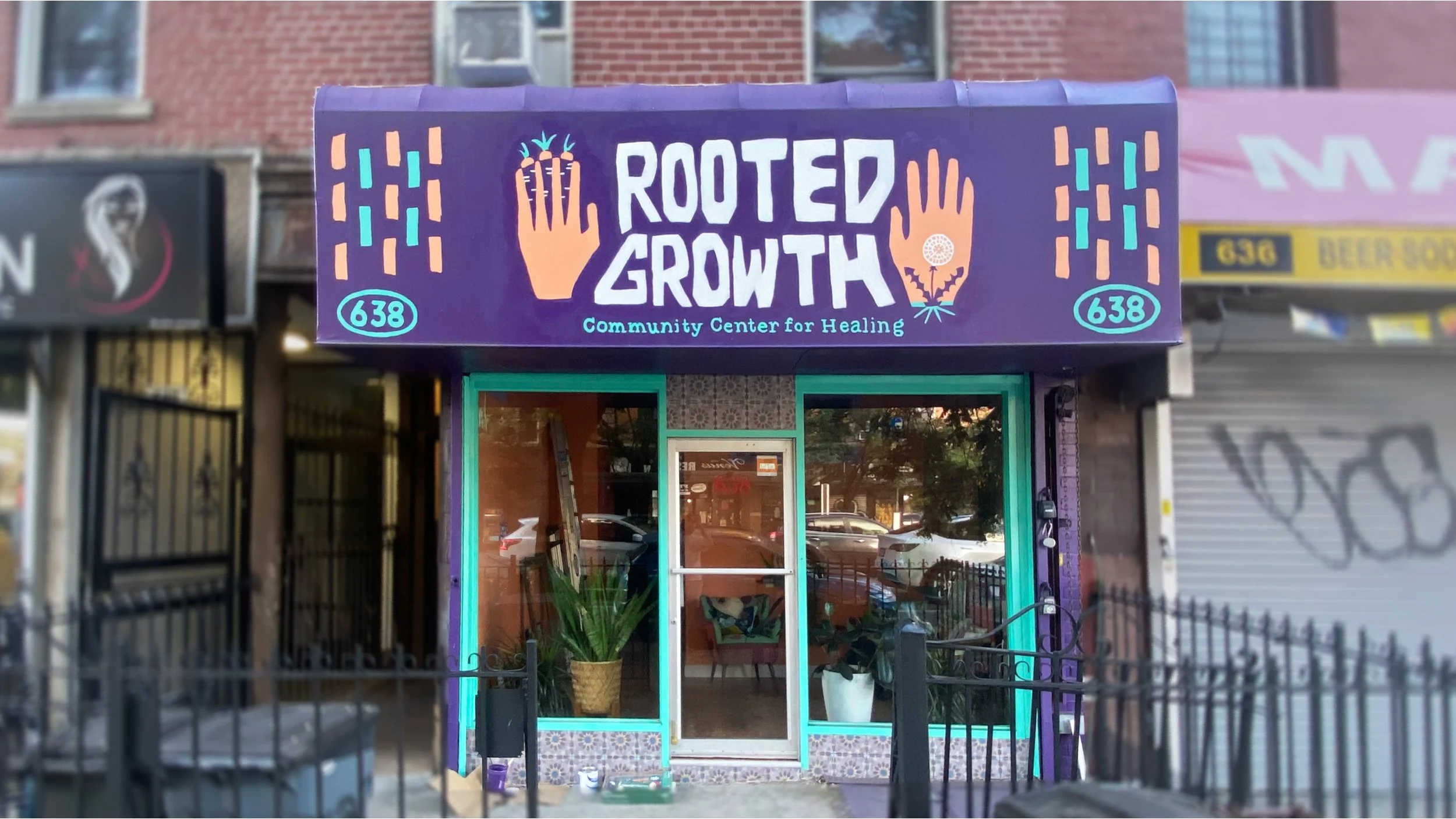
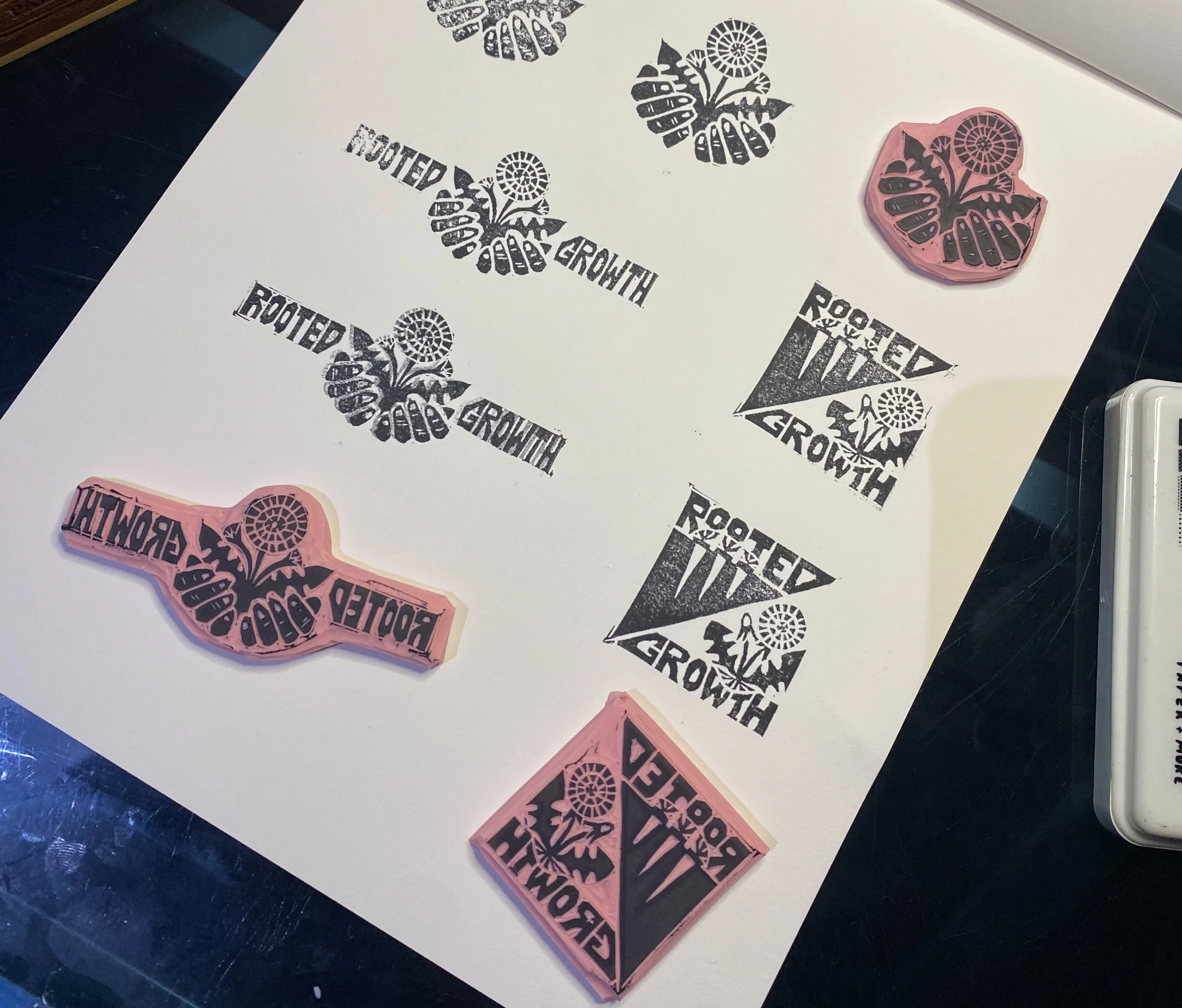
Symbolism played a quiet but powerful role in shaping the identity. Elements like hands, root vegetables, dandelions, and simple geometric forms reflected collective care, growth, and healing as something we do together. Every visual choice was made with intention, so the identity could connect authentically with the people it was meant to serve.
The final system breaks a few traditional branding “rules,” and that’s exactly why it works. From business cards made from linocut stamps to a storefront painted by an amateur (me), the identity embraces imperfection, labor, and human hands. The process wasn’t always comfortable (including when I literally had to work from the top of the ladder), but that discomfort is part of the work.
Rooted Growth is proof that when branding is rooted in values, community, and care, it can be both expressive and strategic. Designing this identity wasn’t just about standing out. It was about showing up honestly, and creating something that truly belongs to the people it serves.
If you’re building something rooted in values, community, or care—and you’re wondering how to translate that into a visual identity that actually feels like you—I’d love to talk. Whether you’re at the very beginning or somewhere in the messy middle, thoughtful design can help clarify your message and bring people together around what matters most. Feel free to reach out, follow along, or simply take what resonates and apply it to your own work.